blankPixels.com – The Final Theme
Yes! I have decided on blankpixels.com‘s final design and theme! After months of contemplating on my own blog’s design, I finally chose this theme and just made some tweaks to satisfy my color choices.
I was actually thinking of coming up with my own layout, but I’ve been REALLY busy. I did some searching for themes that I’ll fall in love with, but this was the only one that inspired me. Let me tell you more about how I decided on this theme:
Arthemia Theme
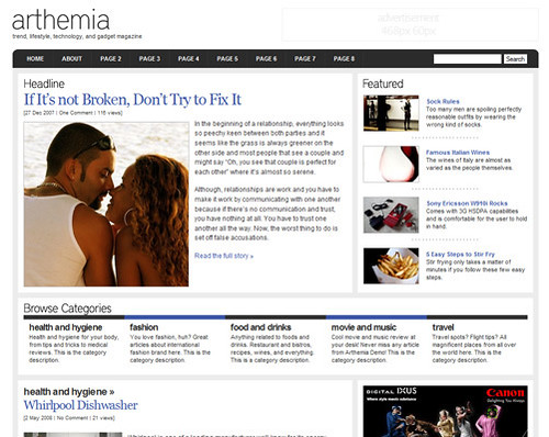
When i saw this theme designed by Michael Hutagalung, I fell in love with it. I was initially looking for a dark theme, but I loved the combination of dark gray, very light gray and white. I was actually looking for a black and white theme, but couldn’t find any that looked as clean, simple and yet beautiful as this one. Plus, when I saw this, I immediately knew what I wanted to do to tweak it.

That’s how this theme initially looked like. I changed the colors, removed the advertising on top to give way to a larger header.
I’m still not done adding widgets on the sidebars and footer. But, I’m done with tweaking this theme.
The Header
When I decided to change the niche of this blog to a general geek blog, I already had a header design in mind. And, I found just the right vector for it. I just changed the colors of the hair of that geeky girl to match my hair color.

I love the simplicity of the header I made. It’s simple yet fun. Well, that’s my opinion. *LOL*
I really need to finish the whole layout now. I still have no posts under Headlines and Features (this post will be the first). And I need to find other widgets that I’ll place on the footer. I can’t wait to finally post some more geeky stuff on here! Keep posted! 🙂
What do you think of my blog’s theme?!
